

ROC-Kurve (receiver operating characteristics)
ACOMED statistik is a statistical service provider specializing in the planning and evaluation of diagnostic studiesFurthermore, we support companies in the pharmaceutical industry, Medical device industry
as well as CROs involved in the statistical planning and evaluation of clinical studies and in the SAS programmingWe continue to offer Statistics consulting
and Statistics training courses
to.
This page provides information on ROC curves, their calculation, application, and interpretation. If you require assistance with planning and analyzing your diagnostic study, please do not hesitate to contact us (Tel.: 49 (0) 341 3910195).

Receiver operating characteristics (ROC) curves provide an overview of the diagnostic accuracy of a diagnostic test. They compare the true positive rate (TPF) to the false positive rate (FPF) for various cut-off values—usually, each measurement point is used. The true positive rate (TPF) corresponds to the sensitivity, and the false positive rate (FPF) to the difference of 1 minus the specificity (note the inverted scale of the x-axis when specificity is reported).
A test lacks diagnostic accuracy if TPF = RPF. This is the diagonal from the bottom left to the top right (grey line in the figure).
The figure shows the ROC curve with its confidence band. Selected cut-off values are also indicated.
ROC curves are, among other things, a tool for selecting cut-off values; you can find more information here. here.
The diagnostic test demonstrates discriminatory power if the curve differs significantly from the diagonal (bottom left - top right). Ideally (100% discriminatory power), the curve lies on the left or top boundary of the enclosing square.
A measure of the test's quality is the area under the ROC curve (AUC). The area can take values between 0.5 and 1, with a higher value indicating better performance. The AUC is most easily calculated using the trapezoidal method, which generally provides a good estimate of the area.


The area under the curve AUC is an overview measure and characterizes not
Diagnostic accuracy in the regulatory or clinical sense. In a clinical context, a test is used for a specific false-negative rate or a specific false-positive rate (or range), meaning one considers whether to accept a higher false-positive or a higher false-negative rate. The correct way to express diagnostic accuracy is therefore a pair of values {Sens; Spec}. Alternatively, the predictive values {PPV; NPV} or (rarely) the diagnostic likelihood ratios {DLR , DLR-} can also be given.
The following illustration clearly shows that specifying the area is not helpful:

The example shown here refers to 3 tumor markers in bronchial carcinoma (data fromKeller T et al. (1998): Tumor markers in the diagnosis of bronchial carcinoma: new options using fuzzy logic based tumor marker profiles. J Cancer Res Clin Oncol 124:565-574) the AUC for Cyfra 21-1 is significantly (and statistically significantly) larger than the AUC for the other two markers.
In the clinically relevant range (high specificities), the sensitivities of Cyfra 21-1 and CEA hardly differ. Therefore, the AUC is not helpful for reliably assessing diagnostic accuracy in clinical use.
Further information on ROC curves
The area under the ROC curves follows the same statistics as nonparametric, comparative rank tests (Wilcoxon statistic). The significance of an AUC against the diagonal can therefore be easily calculated using the usual tests (Mann-Whitney U test). The AUC (see ROC Tool 1) can also be estimated directly from this statistic: AUC = U/(N1*N2), where U is the test statistic of the Wilcoxon statistic, and N1 and N2 are the group sizes.
Therefore, ROC curves are not only suitable for quantitative characteristics, but also for qualitative characteristics that can be ordered (ordinal scale), such as findings from X-ray images, scores, etc.
Comparing ROC curves (testing for differences in AUC, see ROC Tool 2) is complex. The crucial factor is whether the ROC curves were obtained from the same patient cohort or not (linked vs. unlinked samples). If ROC curves overlap, it is advisable to compare them, for example, only within a selected specificity range.
One solution is to use contingency tables for either identical specificities (then: comparison of sensitivities) or identical sensitivities (then: comparison of specificities). These tables can then be compared using the McNemar test (paired sample, multiple tests are examined in one study; this is the norm for such analyses) or the chi-squared test (unpaired sample).

The slope of the line connecting the lower left origin to a point on the ROC curve (blue) gives the DLR . The slope of the line connecting the point to the upper right corner (green) gives the DLR-.
You can purchase 2 Excel tools for ROC curves.
(See images below: left: one ROC curve, right: comparison of two ROC curves of linked data)
Compatible with Excel 2000 and later versions (Windows environment).
Cost: €20 per tool. Please inquire via email (info@acomed-statistik.de).
You can also create ROC curves using the software programs.Analyses can be generated by Analyse-It, Medcalc, SPSS, SAS (there as part of PROC LOGISTIC), GraphPad Prism, etc.
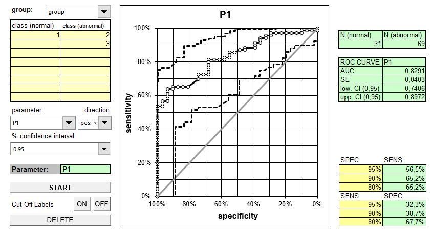
Excel tool ROC curve (displays ROC curve, calculates AUC including confidence interval, estimates sensitivities for given specificities, and estimates specificities for given sensitivities. Variable input in long format (1 column for measured values, 1 column for disease group)).

Excel tool 2 ROC curve (displays ROC curves, calculates AUC and their difference, each including confidence interval, p-value for comparison. Variable input in long format (1 column for measured values, 1 column for disease group)).